Choosing the right poster size for gaming room setups helps turn a simple desk into a cohesive, pro-quality space. Market predictions show the niche will keep growing, so wall art should match the gear on the desk.
They should pick dimensions that create a clear focal point without overwhelming the monitor area. A matte print cuts glare under RGB lighting and keeps colors vivid.
Placement matters. Keeping artwork about 6–12 inches above the monitor keeps balance and eye comfort. For multi-monitor rigs, a horizontal gallery of smaller prints often works better than one oversized piece.
High-quality prints with bold colors and sharp details draw attention and lift the whole setup. Before buying, always measure available wall space and consider frames, style, and negative space to get the best look.
Learn practical layout tips and measurements in this detailed guide: wall art design guide.
Why Your Gaming Setup Needs Wall Art
Adding art above a workstation brings cohesion and gives the whole space a clear identity. Gamers invest heavily in hardware; a single well-placed poster or a small gallery of posters completes that investment visually.
Newzoo reports gaming is a $188.8 billion industry in 2025, which shows players care about both performance and presentation. A piece of art bridges the digital and the physical and makes the desk area feel intentional.
A new print can act as a focal point, drawing attention and reflecting personal taste. They can choose a large centerpiece or a curated collection of smaller prints to balance monitors and lighting.
- Makes the space inviting: wall art helps friends and viewers connect with the player’s style.
- Defines a brand: streamers use artwork to reinforce identity on camera.
- Enhances comfort: color and matte finishes reduce glare and support longer sessions.
Determining the Ideal Poster Size for Gaming Room Configurations
Good layout begins with accurate wall measurements and an honest read of how much visual space is available.
Understanding standard poster sizes simplifies the process. Common dimensions range from 8.5″x11″ and 11″x17″ up to 36″x48″. A 24″x36″ print often works well because it offers impact without crowding the desk area.
Measure the width of the desk and monitors, then subtract at least 6–12 inches on each side to keep balance.
Standard Dimensions for Desks
- Small desks: choose 11″x17″ or 16″x20″ pieces to avoid overwhelming the setup.
- Medium desks: 18″x24″ or 22″x28″ prints offer a clear focal point.
- Large desks: 24″x36″ or larger can anchor a multi-monitor layout.
Measuring Your Available Wall Space
Consider viewing distance: larger poster sizes work best when seen from across the room, while smaller prints fit closer setups.
A vertical stack of two smaller pieces helps in narrow areas. Keep frames consistent to maintain a clean, professional look and ensure the artwork complements the setup instead of competing with monitors.
“Plan dimensions around your desk and viewing distance; the right scale makes the whole setup feel intentional.”
Matching Artwork to Your Gaming Genre
Choose artwork that echoes the themes and energy of the titles they play most.
Anime and hypebeast prints are top picks. Anime pieces bring bold line work and vivid color that complement on-screen visuals. Hypebeast-style posters add a collectible, streetwear vibe that turns a plain wall into a focal point.
Sim racers often use automotive prints to tie their rig to the surrounding space. A high-quality Porsche 911 print can anchor a dedicated setup and reinforce the room’s identity.
Music and rhythm fans should pick darker palettes that play well with RGB lighting. That contrast keeps the monitor visible and draws attention to the art without overwhelming the view.
A well-curated collection of posters or a single striking piece can change how the whole area looks. Choose matte finishes and matching frames to reduce glare and keep the display professional.
“Match colors and theme to gameplay to create a cohesive, intentional backdrop.”
- Pick prints that reflect favorite franchises.
- Balance color with existing lighting and decor.
- Prioritize high-resolution print quality and consistent frames.
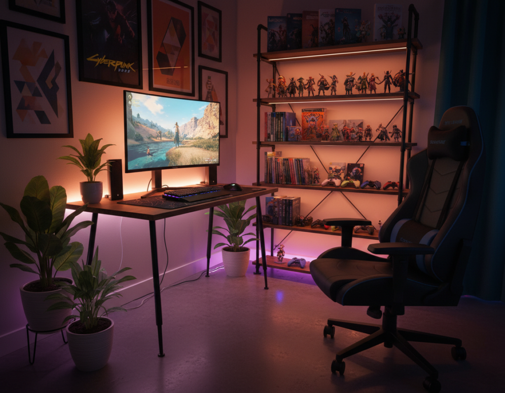
Strategic Placement Above Your Monitor
A well-planned backdrop can make the desk area look intentional and camera-ready. The wall behind the monitor is the primary visual field during play and on stream, so placement matters more than style alone.
The Backdrop Zone
Position artwork 6–12 inches above the top bezel to keep a clean separation between screen and wall. This distance reduces neck strain and frames the monitor without crowding it.
Consistent frame placement creates a studio-grade look and helps the whole setup read as a single design.
Handling Multiple Monitors
For dual or triple displays, use a horizontal gallery of smaller prints rather than one large piece that overwhelms the span. Align frames at a single centerline so the collection feels balanced.
If streaming, mark your webcam’s visible area with painter’s tape before hanging any artwork to ensure pieces appear where intended on camera.
Small Room Strategies
In tighter spaces, a single 18×24 print works well as a focal piece above the monitor without cluttering the walls. Leave breathing room between the chair and the wall so the backdrop looks intentional on camera.
“The wall directly behind your desk is the most important backdrop zone; it shapes what viewers see and how the space feels.”
- Keep prints 6–12 inches above the monitor bezel.
- Choose a horizontal gallery for multi-monitor setups.
- Use tape to map webcam boundaries before final placement.
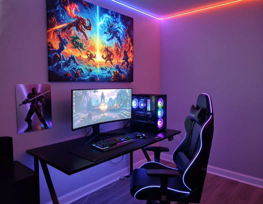
Coordinating Prints with RGB Lighting
Smart LED placement can make darker pieces pop and give the whole setup a gallery feel. Coordinating lighting with wall decor helps the space feel deliberate. It prevents the backdrop from looking chaotic under changing color profiles.
Creating Contrast with Dark Art
Dark backgrounds with bright accents work best under RGB. The deep tones absorb ambient glow, while highlights catch the LEDs and read crisp on camera.
Cool-toned artwork—blues and teals—react strongly to blue or purple presets. Warmer tones on side walls create contrast and guide the eye. Use separate zones: cool behind monitors, warm on flanking walls.
A simple LED strip positioned above a frame and angled downward at 30 degrees creates a professional spotlight effect for under $15. That small tweak makes a poster or print feel like a gallery piece.
“Treat your posters like gallery exhibits and let lighting change the mood without swapping art.”
- Check default profiles: test how your base lighting alters colors before final placement.
- Use consistent frames so light reads evenly across a collection.
- Map zones: define cool and warm areas to highlight chosen artwork and walls.
Budgeting for Your Gaming Den Decor
A clear budget helps prioritize one high-impact piece or a coordinated set that ties the whole space together.
Costs can run from about $20 for a single starter poster to $150+ for a full, curated gallery wall. At the starter tier, they should spend on one visible print above the monitor to maximize impact.
Simple black or white frames typically cost $8–15 and instantly lift the presentation. For a mid-range plan, two to four matching pieces create a cohesive design that reads as intentional.
Premium budgets allow building an entire gallery composition with planned dimensions and lighting that treats the walls like exhibits. Quality frames matter as much as the posters themselves.
- Map the layout on the floor before hanging to avoid extra holes.
- Start with one strong artwork rather than many unframed prints.
- Balance spend between print quality, frames, and accent lighting.
“Invest in one standout piece first; it anchors the whole room and makes later additions feel deliberate.”
Optimizing Your Backdrop for Streaming
A simple, well-composed wall behind the webcam improves on-camera presence instantly. Streamers should plan the backdrop so viewers notice the host first and the decor second.
The Negative Space Rule
Keep 15–25% negative space inside the webcam frame to avoid visual clutter. This breathing room helps the facecam overlay and game feed not compete with wall decor.
Camera Angle Considerations
Place bold, high-contrast artwork where cameras can pick up shapes clearly. Detailed prints often look muddy after compression; choose graphic pieces that read at small sizes.
- Maintain 2–5 feet between the chair and the backdrop wall to avoid a cramped look.
- If the desk is pushed against the wall, use side walls or angled placements so posters remain visible.
- Avoid covering every inch of the wall; a few framed pieces give a polished, breathable design.
“Viewers’ eyes should rest on the creator first, then notice the art—keep the focus clear.”
Selecting the Right Finish for Your Prints
Finish choice directly affects visibility and longevity of artwork in a lived space.
A matte finish often works best above a desk because it cuts glare from monitors and RGB lighting. Matte keeps colors readable even when natural light changes during the day.
Glossy options boost vibrancy and make colors pop in a well-lit wall. They suit high-traffic areas where impact is the priority, but reflections can distract on camera.
Durability matters. Some materials resist fading and wear better than others, which keeps the art crisp over years. Buyers should check provider specs to confirm coating and UV resistance.
“Match finish to the lighting and the intended use; a small change can improve clarity and extend life.”
- Matte: reduces glare and reads well under mixed lighting.
- Glossy: increases color punch but can reflect bright sources.
- Check specs: confirm fade resistance, recommended cleaning, and available size and framing options.
Choosing the right finish helps ensure the wall art remains a clear focal point of the space. It supports the overall design and keeps pieces looking intentional on camera and in person.
Essential Design Elements for Impactful Displays
Strong typography and clear visual order turn an average wall into an instant focal point.
Typography and Visual Hierarchy
Start with headline choices. Use bold, high-contrast lettering for main headlines to guide the eye and set a clear anchor on the wall. Pick clean sans-serif faces like Helvetica or Montserrat when pieces need to read from a distance.
Limit fonts to two complementary options. That keeps layouts balanced and prevents the display from feeling cluttered.
Use white space and hierarchy. Give headlines room to breathe, then place supporting lines in lighter weights or smaller scales. Visual hierarchy ensures the most important information is seen first when someone enters the room.
- Extend background graphics to the bleed margin for clean prints.
- Favor simple, high-contrast type for distant legibility.
- Keep one focal piece and complement it with smaller posters or matching prints.
“A clear typographic system makes art feel intentional and professional.”
Technical Tips for High-Quality Poster Printing
Print prep starts with resolution—poor files become blurry prints, no matter how good the design.
Use 300 PPI as the baseline when preparing artwork. For large pieces meant to be viewed at distance, 150 PPI can be acceptable and saves cost.
Always include crop marks and at least a 0.125″ bleed. That prevents white edges and ensures clean trims.
Match raster images to the final output dimensions so photography stays sharp. Low-res images will look pixelated when viewed up close.
- Check color profiles (usually CMYK for print) so on-screen vibrancy translates to print.
- Use vendor templates to scale artwork and avoid mismatches.
- Run a final file check: resolution, bleed, crop marks, and flattened layers if required.
Following these steps yields professional-grade prints that enhance the desk space and last years.
Conclusion
,
A well-chosen print can unify a desk area and lift the whole space with minimal effort.
Selecting the right prints balances aesthetics, budget, and personal taste. They should plan negative space, follow placement guidelines, and pick finishes that reduce glare.
Whether choosing a single large piece or a small curated gallery, matching colors to RGB and measuring wall dimensions helps create a cohesive backdrop. High-quality prints keep visuals vivid and durable over time.
Practical steps: measure the available wall, map camera boundaries, and test lighting before final hang. With those checks, they can transform a battlestation into a polished, immersive space.